


 This past month I had the pleasure of working with a lovely lady, Beth Lowenfeld, to create the branding, print materials and website for her new home staging and colour consultation company, Hue Home and Colour Inc. It was such a fun project! And I really loved how all of the materials turned out! The colours are so vibrant. And with a company named 'Hue', that is pretty important!
Take a peek at her new logo, business cards, gift certificates, note cards, folders, and website. We ordered some beautiful chartreuse envelopes to match the notecards and gift certificates...what a purty package when it all came together!
Best of luck, Beth! Your biz seems like it's off to an amazing start already.
 I will soon be launching a new line of mommy and daddy card designs! See above for Shanna's new mommy cards, hot off the press. Stay tuned for the new designs...

 Hopefully you aren't too sick of my adoration for Anthropologie yet? Because I got two pretty pieces of mail from them this week {in the midst of my bills and flyers} and I just had to share. Each piece is simple, but well designed and cuter than can be. I'm scratching my head at how they were able to pull off these seemingly handmade pieces for a mass mailing though. They are just too clever!
 I've had a font crush on Feel Script {above} for a while now...but after making a recent and pricey font purchase, I will have to hold off for just a while. Isn't it beautiful though? After some digging I was happy to find a similar font for free...At Mahogany Script {below} doesn't have all of Feel's fabulous flourishes, but it's a good substitution while the funds replenish! Have a wonderful weekend...


 Have you seen the new Ecofont? Inspired by 'holey' cheese, SPRANQ Creative Communications in the Netherlands developed this font with little holes in it to cut down on the amount of printer ink used. This font can cut down up to 20% of ink usage and yet it still maintains readability! The Ecofont can be downloaded here for free...what a great idea! It has its own cute little website too.

 I recently finished a design project that I wanted to share here! I created a logo, business card, and website design for a new company called Little Party-Goers that offers child care at weddings and events. What a great business idea! Owner Maria Vrontos, doesn't just babysit children at events - she does crafts and activities and makes it fun for them. And armed with a background in Early Childhood Education, she knows what she is doing!
Maria required a logo that was professional but still fun-loving and kid-like. She wanted the colours blue, lavender and green to be incorporated, and for flowers to be used as a design element - however she didn't want her logo to be too girly-girl. Voila - here is the final logo and the business card which turned out great! The website is currently in development, but I will announce once it's up and running. Good luck Maria, on your new venture!
 I'm a blogging machine today! Just wanted to share this Save the Date{s} emailer I created for my sister and her fiance who are getting married twice this summer - once in Uxbridge, Ontario and again in Haifa, Israel.
Also I recently created a Flickr account with samples of all of my design work - print, web, logo design, wedding invites, etc. - just until I have my website up and running {I am working on it, I swear!}. Check out my Flickr account here!
 Lots of tears and chills today...what a speech! Remarkable. A warm congratulations for our neighbours to the south...
{These Obama posters are downloadable - and free - from Hyperakt}.
This is a great time of year - a fresh beginning, and a time to get set for the year ahead. Stricken with a miserable cold this past week meant that computer work was a bit tricky, and I am actually pleasantly surprised that my previous posts make any sense! But I am a workaholic, so I had to put my energy somewhere. And that somewhere was in organizing and tidying and getting 'set' for the new year - making a new file for my 2009 receipts, starting a fresh new organizer {how I love my organizer} and I bought some of the cutest mini Moleskines to stick in my purse, to record any bursts of design or blog inspiration while I'm out.
In organizing everything, I came across some interesting things I hadn't seen in a while - some blasts from the past! I found my first 'real' pencil drawing {a hunk with rippling muscles holding a baby of all things} created when I was 13 years old. This was the very piece that named me an artiste in my family, and my mom rushed out and signed me up to an art class straightaway.
 This mug was also in a box I hadn't been opened for years - my first foray into graphic design! I designed it as a give-away for my Senior Prom. Although I copied the fonts pretty much exactly from a coffee table book {boys and prom dresses were much more of a concern than copyright infringement, apparently}. But I have to admit that it looks pretty good considering it was created using a 1990's version of Word Perfect.
 It was fun to find these old treasures, and looking back they were all clues pointing to where I would end up. I took some strange turns, and a twisty journey to where I am now. But it is quite apparent that from a young age, I was in love with art and design.
 What a year! And it's hard to believe it has flown by! But it has been a great one - a year of new independence and much success and I am so happy to have formed my new 'blooming' company only a few months ago. Writing this blog has been amazing too, and I look forward to 2009 and the many new ideas, projects, and ventures that are just around the corner.
Happy New Year to all! And in the meantime, I'll leave you with a postcard of inspiration from one of my favourite stores, Lululemon {click on the postcard for a large version!}. I think it will be my mantra for 2009 to 'dance, sing, floss, and travel.' All the best!

 I'm a sucker for good packaging...and yes, I do judge a book by its cover {and sometimes I wander into bookstores simply to stare at book covers!}. Take a peek at this beautiful packaging for Thymes Sweetleaf Baby. Created by the renowned Duffy & Partners, it was actually hand-painted and illustrated which is a refreshing change from computer graphics. So delicate and lovely! {seen via The Dieline}.
We really like green here at inBloom Studio, and that definitely includes green companies that are doing great things for the environment. I would like to introduce Platypus - a new not-for-profit company that sells cute animated e-cards and greetings, and donates the money toward carbon offsetting.

 I collaborated on the Platypus logo design a few months ago, and I also helped design the look of their new website which just launched this week! The Platypus 'people', Brenda Morrow and Murray Foster {who plays bass for Canadian band Great Big Sea}, are extremely down-to-earth and have a genuine concern for the environment, hence the launch of their new venture. Please check out their website and their cute e-card animations and don't hesitate to make a donation to a great cause.
 Have a wonderful weekend! I hope it's as sweet as this beautiful packaging spotted at William's Sonoma {via the Dieline} which is just as yummy as it's contents I'm sure.
Although this weekend I think I will be missing Tina Fey's brilliant Sarah Palin portrayals on SNL. Let's hope there is just one more! Tina Fey, you are my hero.
 Last year I created a logo {a funky 'inked' stamp motif}, business card, and stationery design for Alison Burke of the the Public Relations firm, Impressions PR. Alison just got her business cards printed on a thick white matte cardstock and they look amazing! It is really one of my favourite things to see how my onscreen designs translate onto paper, as I am a self-proclaimed paper nerd. I really love the vibrancy of the blue on the reverse side, and how the 'pr' is drawn out of the word 'impressions'. This card is a looker...
 So with her branding done, Alison and I set out to create a simple but informative website that matched the Impressions PR brand. Alison wanted a very stark, professional look {we used a simple, striking palette of black, white, and blue} but with some quirkiness {in the form of vintage black and white photographs} - and a beautiful site was born! Check out the recently launched website, www.impressionspr.ca - this is one of my new faves!
By the way, if you are in the market for PR, Alison is your gal! I worked with her on a PR campaign last fall and she was able to get our enviro holiday cards into many magazines across the country. She comes highly recommended and yes, does create some pretty darn great impressions.

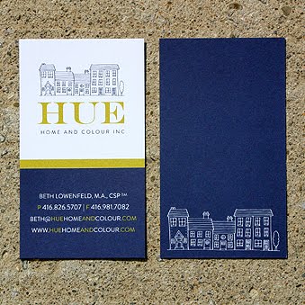


 This past month I had the pleasure of working with a lovely lady, Beth Lowenfeld, to create the branding, print materials and website for her new home staging and colour consultation company, Hue Home and Colour Inc. It was such a fun project! And I really loved how all of the materials turned out! The colours are so vibrant. And with a company named 'Hue', that is pretty important!


