


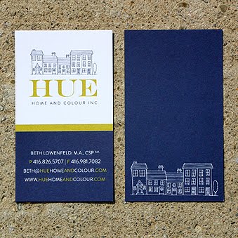
 This past month I had the pleasure of working with a lovely lady, Beth Lowenfeld, to create the branding, print materials and website for her new home staging and colour consultation company, Hue Home and Colour Inc. It was such a fun project! And I really loved how all of the materials turned out! The colours are so vibrant. And with a company named 'Hue', that is pretty important!
Take a peek at her new logo, business cards, gift certificates, note cards, folders, and website. We ordered some beautiful chartreuse envelopes to match the notecards and gift certificates...what a purty package when it all came together!
Best of luck, Beth! Your biz seems like it's off to an amazing start already.
 I'm excited to present a website that I recently finished for Art on the Move - an initiative by Lakeshore Arts and Arts Etobicoke in Toronto. This 3-year project has professional artists working with community members to create 'moving art' - vehicles such as buses and trucks wrapped in art, instead of advertising.
It was so wonderful to be a part of this artistic initiative! The client wanted a very clean, easy-to-navigate website that matched the look of their logo. I've always loved the robin's egg blue and red combo, and was excited to use it here. Click here to take a peek at the website, and to see what Art on the Move is all about!
 Have you heard of Big Cartel? It's a cool program that allows small businesses to host an online shop without all of the hassle - or in their words 'Simple Stores for DIY Rockstars'! I decided to create a small store {it's free for 5 items and under} to sell some prints of the nature pattern watercolours I created in my Australian illustration course. I've found a way to print the paintings on watercolour paper so they look almost identical to the original art. Check them out at inBloom Studio Boutique!

 Remember when I mentioned that one of my clients had created the cool swag for the Juno Awards a few weeks ago? Well Gabrielle of The Uptown Giftbox Company was kind enough to send me some photos of the logo I created for her company onscreen at the award show...very cool! Thanks so much Gabrielle.
And speaking of Canadian music...it has become a tradition that my dad, sisters and I see a Chantal Kreviazuk concert every once in a while at a small and intimate venue. Last night we went to the brand spanking new Richmond Hill Performing Arts Centre {beautiful I might add} and it was a stunning concert! I loved the singing, the banter, the mix of piano, cello and violin and the emotion in each song. My sister said it best today but I just wanted to say that I love love loved every minute of it {including her moppy-haired little boys who joined her onstage for the final song}! And now I have a new secret dream, seeing that I probably won't be a backup dancer for Janet Jackson anytime soon...I want to play the cello.
 A quick thank you to Celia of Design for Conscious Living for the shout-out to me and inBloom Studio on her new blog! I am blushing...
I recently designed Celia's business cards and had them printed on a linen cardstock and they turned out beautifully! For more of Celia's work, you can check out her website here...

 I recently complete a logo and business card design for Suzanne Perrett of Organize My Chaos - a professional organizer. And man, is Suzanne organized! So prompt and efficient in fact, that I started the logo on a Monday and both the logo and business cards were signed off by the Friday - that is unheard of!
Suzanne wanted a motif that symbolized organization {something neat and tidy} using a clean and simple font. She also wanted to use a cheery yellow {or 'mimosa' as I like to call it} which I loved - so sunny and bright! I came up with this motif of some very organized and lined-up dots with a clean font that gets just a little bit awry on the word 'chaos'. And I loved her business cards too as she opted for a clean, one-sided card with a raised logo and tagline {the bumpy dots look great!} and her contact information printed flat.
I will soon start work on her website re-design...I can tell that will be a fun, not to mention a very efficient, project!

 I recently finished a design project that I wanted to share here! I created a logo, business card, and website design for a new company called Little Party-Goers that offers child care at weddings and events. What a great business idea! Owner Maria Vrontos, doesn't just babysit children at events - she does crafts and activities and makes it fun for them. And armed with a background in Early Childhood Education, she knows what she is doing!
Maria required a logo that was professional but still fun-loving and kid-like. She wanted the colours blue, lavender and green to be incorporated, and for flowers to be used as a design element - however she didn't want her logo to be too girly-girl. Voila - here is the final logo and the business card which turned out great! The website is currently in development, but I will announce once it's up and running. Good luck Maria, on your new venture!


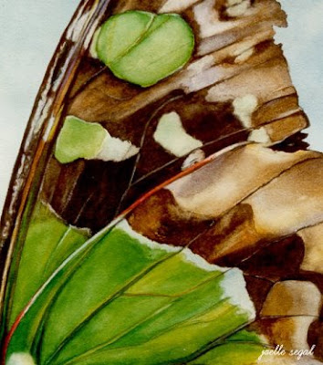 Unbelievably, this week is the 10th anniversary of my journey to Australia where I spent a year studying Plant and Wildlife Illustration. How the heck does 10 years fly by so quickly? I remember it all very clearly, and 10 years ago on precisely this week, I left in bone-chilling -40 degree Celsius Toronto temperatures {is that possible?!}, and arrived in Sydney in blistering +40 degree Celsius heat {is that possible?!}. And right about at this time, while trying to get accustomed to the 80 degree temperature difference, I was 'trampolining' off the thickest, sturdiest spiderwebs I have ever seen {don't get me started on the spiders}, reaching for my shampoo bottle only to grasp a leech that was stuck to the side, and watching in awe as a wallaby hopped past me on my university's campus. That year was such a wonderful experience that I'll never forget. There were many lonely times, there's no doubt - I was a 22 hour flight away from my family and they were usually sleeping while I was awake! But my adventure taught me how to depend on myself. I became very strong and independent...I grew up.
Aside from all that I learned outside of the classroom, I was able to concentrate on painting and drawing for a full year, which was a dream! To commemorate my 10th anniversary, above are some of the illustrations I created, in hopes of creating them into a children's book {I still hope to one day!}. They are patterns in nature, painted in watercolor, and the premise was to get children to look closer at nature, to gain an appreciation for it at a young age.
I will be posting a bit more about my Australian adventure, but in the meantime my thoughts are with those suffering from the horrific bush fires that have been roaring near Melbourne. Here is a blog that is selling various donated handmade items to raise money for those affected - such a wonderful idea.
 Sometimes I have the need to write a little note to a client - in a mailing, if I'm sending samples, or even just a simple thank you. Recently I printed my logo on these little scalloped recycled notecards...perfect for sending just a quick little jot! {click the photo for a closer view}
 I'm a blogging machine today! Just wanted to share this Save the Date{s} emailer I created for my sister and her fiance who are getting married twice this summer - once in Uxbridge, Ontario and again in Haifa, Israel.
Also I recently created a Flickr account with samples of all of my design work - print, web, logo design, wedding invites, etc. - just until I have my website up and running {I am working on it, I swear!}. Check out my Flickr account here!
 Last night Céleste and I met for our Creative Thursday session, and since I have been feeling pear-y lately, she suggested that I do some pear studies in different mediums that I've wanted to try - a great idea! So last night I painted a little pear study with the water mixable oils she recommended {love them} and I added in a textured background using a palette knife and a heavy gel medium. It's a simple little painting but I'm really happy with how it turned out.
The next medium we are going to try is lino-cut printing which is something I haven't done since university when I stabbed myself with a cutting tool. But onward and upward...I'm excited to make a pear-y print!


 This past month I had the pleasure of working with a lovely lady, Beth Lowenfeld, to create the branding, print materials and website for her new home staging and colour consultation company, Hue Home and Colour Inc. It was such a fun project! And I really loved how all of the materials turned out! The colours are so vibrant. And with a company named 'Hue', that is pretty important!


